Overview
About the company
Selectel is an IT infrastructure provider offering 50+ products, including dedicated servers, a cloud platform, managed services, ML solutions, and information security services — all within a single platform.
Users
Selectel products are primarily used by DevOps engineers, software developers, IT administrators, Data scientists and ML engineers in small, medium, and large enterprises. They help streamline IT infrastructure management by offering scalability, security, performance, and automation across a wide range of services.
Problems
- 📌 Inconsistent UI: Lack of a centralised component library led to inconsistencies across the platform with 50+ products.
- 📌 Scalability issues: Lack of reusable components introduced friction in both design and development workflows, limiting our ability to scale efficiently.
- 📌 Unaligned brand and UI: The new brand wasn't reflected in the platform UI, creating a gap between marketing and product experience.
- 📌 Outdated and missing documentation: Component design guidelines were fragmented and unclear, making it difficult to maintain consistency across all product UIs.
- 📌 Frequent support queries: Users often submitted tickets requesting UI updates, responsive design, and a dark theme, as they worked long hours and preferred a more comfortable interface.
Goals
- 🔹 Standardized UI components and patterns: Establish standardized design elements for the UI to streamline development and enhance user experience.
- 🔹 Clear guidelines and documentation: Provide structured and easy to use documentation for both designers and engineers.
- 🔹 Consistency in UI of 50+ products: Plan implementation of UI changes for each product team.
- 🔹 Up-to-date storybook: Build a web version of the design system to make guidelines easily accessible for engineers.
- 🔹 Quicker design-to-development handoff: Minimize time spent on designing UI with standartized components and patterns.
Team
- UX Lead
- 9 Product Designers
My responsibilities
- Led the documentation for core components like alert, notification and drawer.
- Created the shadow effects library used across the entire UI.
- Co-designed foundations of design system along with other designers.
Problem Statement
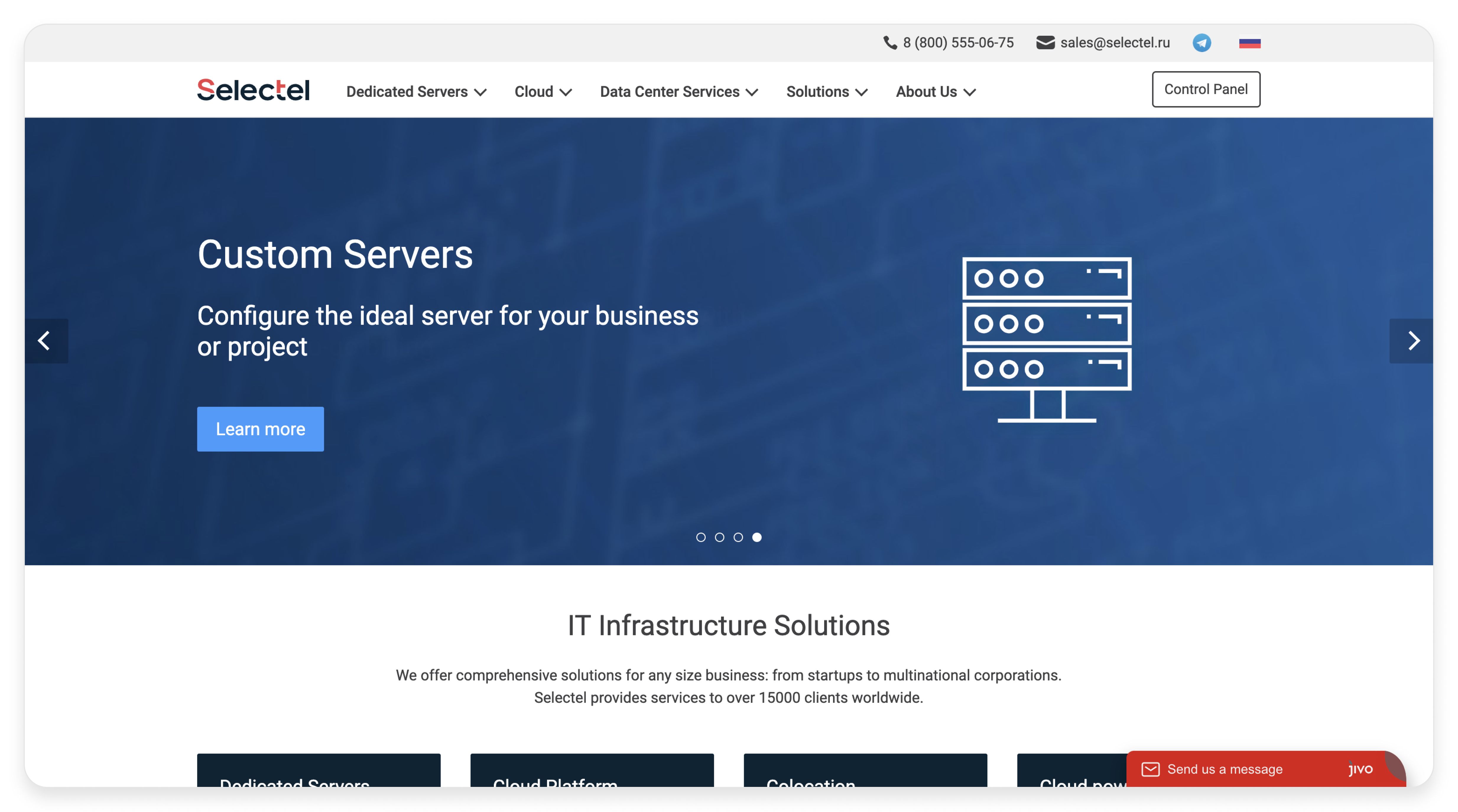
Originally a dedicated hosting provider, Selectel quickly evolved into a comprehensive platform for engineers, offering over 50 products. This shift called for a design update of both the marketing website and the application.
First, we started with an overhaul of the marketing website:
Website before

Website after

App UI before
At the time, Selectel lacked a unified design system. Each designer worked with their own local components, leading to a fragmented and inconsistent app UI.
For instance, clients using both Cloud and Dedicated Servers had to remember different layouts and flows for each product, making the experience confusing and inefficient.

Comparison of Cloud and Dedicated Servers UI
- Different UI patterns were used to display servers—cards for Dedicated Servers and a table for Cloud Servers.
- Inconsistent status displays: a toggle switch was used for Dedicated Servers, while Cloud Servers showed status as plain text.
- Instance interaction differences —Dedicated Server cards were fully clickable, whereas in the Cloud platform, only the server name was linked.
Additionally, documentation was outdated, and some features were implemented without designer involvement, resulting in UI inconsistencies.
Process
The process of creating a design system consisted of 3 main steps:
.png)
Research
Our team of nine designers and a UX Lead set out to build a scalable, cohesive design system. We kicked off with research, auditing existing patterns and studying best practices, while collaborating closely with developers and PMs to align the system with user and business needs.
🕵️ Competitive analysis
- Analyzed competitor UIs to understand how they use components and patterns.
- Benchmarked against leading design systems like Material Design, Carbon, and Atlassian to gather best practices.
📝 Gathering feedback
- Conducted interviews with internal users of our products.
- Analyzed UI-related support tickets to inform design decisions and prioritize improvements.
.png)
🤝 Cross-team colloboration
- Collaborated closely with developers to ensure the design system was technically feasible and easy to implement.
- Aligned the design system with company goals by incorporating valuable feature prioritization insights from product managers.
.png)
Definition
The first challenge we faced when building the design system was deciding where to start. That’s when we turned to the atomic design methodology.

Atomic design is atoms, molecules, organisms, templates, and pages concurrently working together to create effective interface design systems.
Foundations
We started with designing basic atoms of our design system like colours, typography, spacing, icons, elevation and shadows.
Colours
Selectel initially offered only a light theme. Based on user feedback—especially from those working long hours—we introduced a dark theme for better comfort. We also replaced the harsh purple accent with a more accessible blue to better align with the new branding. All colors were tested to meet accessibility standards for readability.
.png)
Colours for light and dark themes.
Spacing
For spacing, we took inspiration from IBM’s Carbon Design System and implemented a 2× grid for consistency and scalability.
.png)
Spacing.
Elevation and shadows
I went through the full list of components, picked the ones that needed elevation, and created a visual diagram to define their elevation levels.

Diagram showing the resting elevation and dynamic elevation offsets for multiple components in Selectel platfrom
I documented shadow properties for each component and built an effect library in Figma, enabling designers to easily apply the correct elevation with just a few clicks.
.png)
Shadow styles defined for all components in both light and dark themes, with documented properties for consistent use across the system.
Icons
Given the data-heavy nature of the Selectel platform, we aimed to strike a balance between clarity and information density. We chose Feather Icons for their simplicity, and when needed, our illustrators created custom icons to cover gaps.
.png)
Icons for light and dark themes.
Components
Structure
We structured components acoording to atomic design:
- Atoms — button, label, toggle switch, etc.
- Molecules — list, alert, notification, etc.
- Organisms — drawer, navigation, dashboard, etc.
Documentation
We defined a standardized structure for component documentation, including name, description, types, use cases, specifications, variants, and references. This made it easier for all stakeholders to navigate and understand the system.

Documentation for button component.
To prevent unnecessary detaching, we implemented slot functionality for custom content. We also embedded documentation directly within components to minimize context switching and make guidance easily accessible.
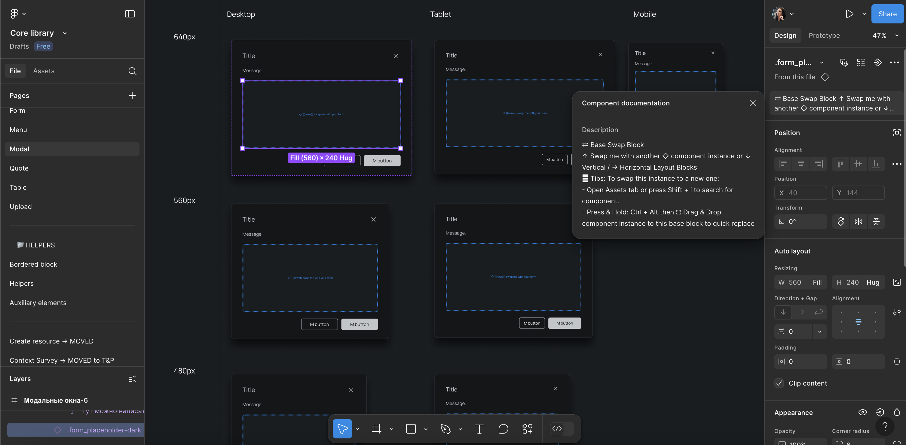
Modal component built with slot support for customizable content.
Variants
Selectel's UI was originally desktop-only. While building the design system, we created responsive components for tablet and mobile to future-proof the platform.
.png)
Alert component designed with responsive variants for desktop, tablet, and mobile.
Handoff to development
To bridge the gap between designers and developers, we decided to create a Storybook as a single source of truth for components. To streamline the process, we worked closely with engineers to align naming, behavior, and structure between design files and code.

Storybook showcasing the design system components.
.png)
.png)
.png)